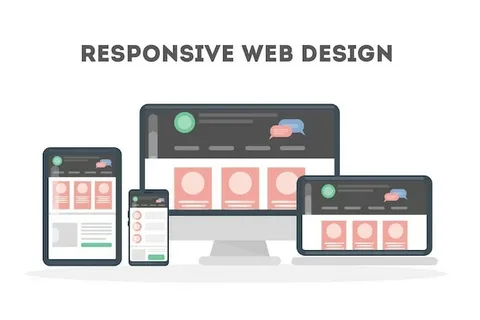
In today’s mobile-driven world, users expect a seamless browsing experience no matter what device they’re using. Whether it’s a smartphone, tablet, or desktop, your website must adapt instantly to different screen sizes and orientations. That’s where responsive web design comes in—ensuring your site looks great and functions flawlessly across all devices.
A responsive website automatically adjusts its layout, images, and content to fit any screen. This flexibility not only improves user experience but also supports your SEO performance and conversion rates. In short, it’s no longer a feature—it’s a necessity.
Why Responsive Design Matters
With more than half of all web traffic now coming from mobile devices, a site that isn’t mobile-optimized is likely to lose visitors quickly. Users won’t stay on a site that’s difficult to navigate, slow to load, or hard to read on a small screen.
Responsive web design addresses these challenges by delivering a consistent experience to every user. It ensures your website’s menus, text, buttons, and visuals adapt in real time—without the need for multiple versions of the same site.
Google also favors mobile-friendly websites in its search rankings. That means responsive design doesn’t just improve usability—it directly impacts how easily customers can find your business online.
How Responsive Web Design Works
Responsive design is built using flexible grids, media queries, and adaptive elements that respond to the user’s screen size. Instead of fixed pixel layouts, elements are sized in percentages and relative units, allowing them to adjust based on the viewing environment.
Images scale properly, text remains readable, navigation becomes touch-friendly, and content rearranges itself logically. This creates a smooth experience across devices, from the smallest smartphone to the largest desktop monitor.
Unlike separate mobile websites or apps, a responsive site maintains one single codebase, making it easier to manage, update, and track.
Benefits of a Responsive Website
A responsive design improves usability, reduces bounce rates, and helps retain users longer. Visitors can easily read, scroll, and interact without pinching or zooming. This leads to better engagement and a higher likelihood of conversions.
It also simplifies content management and lowers maintenance costs since you’re only updating one version of your website. With users accessing your site from various devices, consistency becomes key—and responsive design delivers just that.
Ideal for Any Business or Industry
No matter what industry you’re in, responsive web design is essential. Whether you run an e-commerce store, Digital marketing company Dubai, a local service business, a portfolio site, or a corporate platform, your audience expects instant, reliable access to your content.
From product pages and blogs to contact forms and booking systems, every element must work perfectly on every screen. Responsive design ensures your business meets this expectation with confidence.
Final Thoughts
A website that doesn’t adapt is a website that loses traffic. With responsive web design, your site remains accessible, user-friendly, and optimized for search—no matter how people access it.
Investing in responsive design means delivering a better experience to every visitor, increasing your visibility in search engines, and preparing your business for a mobile-first future. It’s the smart, sustainable way to build a modern online presence that works everywhere your audience goes.